Fall 2012: L’Wren Scott

17 Feb


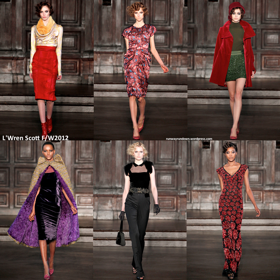
Scott channeled the recent hit — Downton Abbey — in her collection. The show is lauded in the fashion world for making this victorian era super chic. The richness to absolutely every aspect of the collection was stunning — there was nothing simple and relaxed about it. The amazing silk blouse with a cowl neck and the high-waisted gold tweed skirt…I love this collection so deeply and think it is completely beautiful. This collection will, without a doubt, be a huge hit.

Photocredit: style.com

L'Wren Scott Spring 2012

You may also like:

L'Wren Scott Fall 2011


Spring 2012: L’Wren Scott

17 Feb

French Riviera references filtered through this collection and served as Scott’s inspiration for the Spring collection. There was not much variety throughout the show — muted pastel colors with either thinly printed floral overlay or gold designs or the beautiful jackets. The cuts were very simple, very very simple and the idea not the most original but it was a beautiful collection nonetheless.

Photocredit: style.com

you may also like:

L'Wren Scott Fall 2011


Fall 2012: Marchesa

17 Feb


For the second collection on a runway rather than presentation, one thing has become very clear about the direction of this brand. There is a realism — a now — a complete wearability that was completely absent in the past collections. I was surprised by the plethora of mini dresses in the collection and the way that the duo created their signature pieces in a new way. There were some that were undeniably phenomenal and difficult to wear with the wild amount of sheer material and essentially no structure or form. The last gown I selected was literally the most stunning piece I have ever seen and without a doubt I cannot even begin to consider how quickly it will be snatched up for some award. There was a kind of black swan/white swan quality in this that was exacerbated through the extravagance in the collection.

Photocredit: style.com

You may also like:

Marchesa Spring 2012

Marchesa Fall 2011

Marchesa Spring 2011


Fall 2012: Philosophy di Alberta Ferretti

17 Feb

Oh, funky. Work clothes for the futuristic researcher was where Ferretti channeled her artistic intentions. This is the first time (I can recall) where Ferretti ventured into the funky with her materials. Generally, she focuses on keeping things wild and crazy in silhouette and embellishment while working with pretty standard materials. Here she ventures out in terms of the actual construction of the piece. This was, without a doubt, a collection focused on work wear and day wear rather than the glamorous ball gown — a switch for Ferretti but I’d say it’s one that she pulls off. Not my favorite collection but it definitely was great to see her breaking outside her zone and experimenting in such a fun way.

Photocredit: style.com

You may also like:

Philosophy di Alberta Ferretti Spring 2012


Philosophy di Alberta Ferretti Fall 2011

Spring 2012: Philosophy di Alberta Ferretti

17 Feb


There was no loss of glamour in this Ferretti diffusion collection. The color scheme and florals reminded me a lot of the fall collection, yet the cuts were much simpler and more traditional than in the fall. These were perfect pieces and amazing in their easy elegance. They were magnificent yet a bit boring. Many of the silhouette’s reminded me of Alberta Ferretti’s Fall 2011 line with just a little less glamour, a little less elegance. It was an easy collection, simple and the most wearable that I’ve seen in recent times. The colors were magnificent and the floral prints did not feel cliché or too graceful or anything. There was a 1920s edge to this that was phenomenal.

Photocredit: style.com

You may also like:

Philosophy di Alberta Ferretti Fall 2011


Fall 2012: Farah Angsana

17 Feb

Thankfully, Angsana left last season behind her and stepped back in line with her other collections. The show started with a bang — a gorgeous, corsetted and embellished piece with skirt that balloons and blossoms with a high slit that is supposed to represent the blooming of a flower. These pieces were gorgeous and extravagant but I want to focus on the last one. The finale for the collection. This does not work for me though. It either reminded me of eyelashes or like, pubic hair or something. It’s literally a completely sheer piece that has absolutely no modesty and there is nothing aesthetic that I think is appealing here. The colors are cool and in terms of innovation and shock factor, she hit it out in both matters. So far, not really moved by any Angsana pieces.

Photocredit: style.com

You may also like:

Farah Angsana Spring 2012

Farah Angsana Fall 2011

Farah Angsana Spring 2011

Spring 2012: Farah Angsana

17 Feb

Angsana’s choice not to show but present the collection was a mistake in my opinion. The way the lights hit the pieces didn’t flatter them. Angsana pulls together collections rampant with beautiful and glamour gowns and this was definitely not the best light to portray them in. The direct light emphasized bad angles of these pieces and they felt already done in a weird way. The glamour in an Angsana collection was completely absent.

Photocredit: style.com

You may also like:

Farah Angsana Fall 2011


Farah Angsana Spring 2011

Fall 2012: Ports 1961

17 Feb


This collection, again, could not be more different from the spring one. Ports has no clear aesthetic that they work off of time and time again. While complex, the basic silhouette of each piece was very simple. There was a huge emphasis on boxy cuts — a minimization of femininity in a way. There was also the exact opposite with really form embracing pieces like the boxy peplum that angled in for the waist in the most delicate manner.  This was definitely a quality collection albeit not as belief shattering as the Spring 2012 one.

Photocredit: style.com

You may also like:

Ports 1961 Spring 2012

Ports 1961 Fall 2011


Spring 2012: Ports 1961

17 Feb

Ports 1961 is a brand that I have never gotten a grasp on. Granted, I don’t think anyone could really find a common thread through each of their collections. This was super architectural, especially compared to more conservative collection they showed in the fall. There was no distinguishable message to this or anything of the sort. The neons were amazing and really beautifully composed…I loved this collection, like absolutely. The thread of the rope through each piece was stunning and really added a complete new side to these pieces. Pieces such as (my ABSOLUTE favorite) the black and grey construction and the architectural lines were given an entire new dimension by the addition of the neon rope. It would not be as great a piece without this component. The dresses were beautifully done as well and completely unpredictable in their twisting and contorted ways. The shoes were dynamite with the strappy color blocked component. Ports 1961 still makes no sense to me as a brand but this collection inspired me to stick by them and definitely keep an eye on the evolution of the brand because this shows there is something amazing and inventive there.

Photocredit: style.com

You may also like:

Ports 1961 Fall 2011


Fall 2012: Reed Krakoff

17 Feb


Krakoff’s collection was body conscious. This was the first collection I have seen of his that felt like that of a high-end designer. The cuts were beautiful and elegant, the minimalism that was the underlying thread of the collection was fabulous and created such beauty and grace on the model. The pantsuits were tailored in the most amazing fashion and culled so many different styles and ideals. The casual aspect of the fur and the incorporation of it in a “sweat suit” type coat was stunning. Fur in its very nature isn’t casual yet Krakoff worked it into being this chic and stylish piece that felt completely relaxed. The red was stunning as well — intense, and real. I loved this collection and was vehemently impressed with Krakoff’s slow climb to the top.

Photocredit: style.com

You may also like:

Reed Krakoff Spring 2012


Reed Krakoff Fall 2011